Outlast
-
November, 2022
-
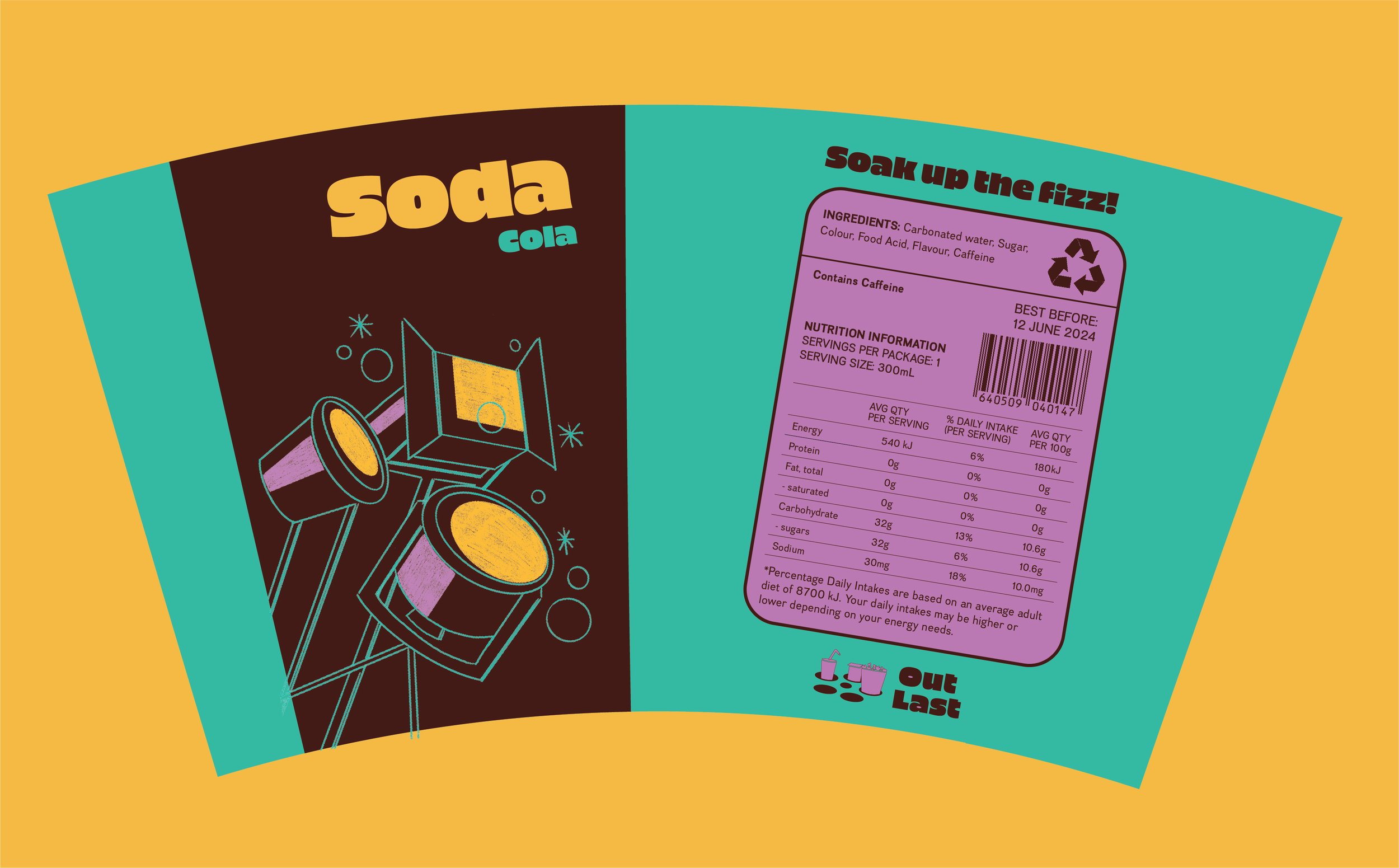
Brand identity and meal box design for the cinema franchise Outlast Cinema. To be used anywhere you may be watching a movie. It can fit on your lap in the cinema and car or beside you in the park. Colour psychology has been used when selecting these bold, rich colours. Overall the package design is nostalgic and joyful while still addressing the needs and wants of the consumer.
Each item has been assigned a word from the phrase ‘lights, camera, action’ (soda is lights “soak up the fizz”, rocky road is camera “get that sugar fix in a flash” and popcorn is action “attack this scrummy snack”). The word is then referenced within the illustration and within the punchline on the back of the packet. The logo is present at large scale on the box and is also present on all items so that the company is identified even when each item is out of the box.


